Principal component analysis (PCA) is used as a dimensionality reduction technique.
When we have a lot of dimension in data it’s difficult to find the dimensions which are responsible for the results. Let us consider a scenario in which you have an army of 10,000 soldiers. How can we determine that the army will win a battle or not?
In order to solve this problem, we check the strength of the army, in order to do that we do a drill. In practice drill, we order the army to fight with the transposed team. This will lead to a covariance matrix. Then as per the result of that fight, we decide the strength and weakness of the team and provide a percentile to each soldier. The new rating will be based on the fight that new ranks are the principal components.
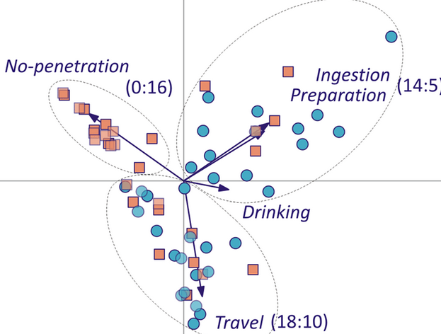
After the drill we find a new dimension like shown in the below figure, we can say those travel a lot have better and last long performance, while who drink have failed in the mid but that is a dimension.
Now let’s check the performance of PCA on mnist data set.
Import libraries
from sklearn.datasets import load_digits
import matplotlib.pyplot as plt
import numpy as np
from sklearn import metrics
from sklearn.decomposition import PCA
from sklearn.model_selection import train_test_split
from sklearn.linear_model import LogisticRegression
from sklearn.metrics import accuracy_score
from sklearn.model_selection import train_test_split
from sklearn.preprocessing import StandardScaler
from scipy.linalg import eigh
import pandas as pd
import seaborn as sn
mnist=load_digits()
#Load the data in X and Y
X=mnist.images
Y=mnist.target

x=X.reshape(1797,64)
Print a few data
num_row = 2
num_col = 5# plot images<br>
fig, axes = plt.subplots(num_row, num_col, figsize=(1.5,2))
for i in range(10):
    ax = axes[i//num_col, i%num_col]
    ax.imshow(X[i].reshape(8,8))
    ax.set_title('Label: {}'.format(Y[i]))
plt.tight_layout()
plt.show()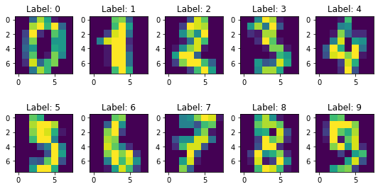
Apply PCA on 30 dimensions.
pca = PCA(n_components=30)
principalComponents = pca.fit_transform(x)
num_row = 2
num_col = 5
fig, axes = plt.subplots(num_row, num_col, figsize=(1.5,2))
for i in range(10):
    ax = axes[i//num_col, i%num_col]
    ax.imshow(principalComponents[i].reshape(6,5))
    ax.set_title('Label: {}'.format(Y[i]))
plt.tight_layout()
plt.show()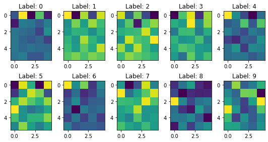
But how can we check the number of the component should we consider, it will depend on the amount of variance explained by the principal components.
pca = PCA().fit(mnist.images.reshape(1797,64))
plt.plot(np.cumsum(pca.explained_variance_ratio_))
plt.xlabel('number of components')
plt.ylabel('cumulative explained variance');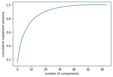
Now Apply Logistics on normal data and on PCA data and check the performance improvement.
pca = PCA(n_components=30)
principalComponents = pca.fit_transform(x)

X_train,X_test,y_train,y_test=train_test_split(x,Y,test_size=0.30,random_state=0)
XPCA_train,XPCA_test,yPCA_train,yPCA_test=train_test_split(principalComponents,Y,test_size=0.30,random_state=0)

model = LogisticRegression()

model.fit(X_train,y_train)
y_pred=model.predict(X_test)

model.fit(XPCA_train,yPCA_train)
yPCA_pred=model.predict(XPCA_test)

print("Accuracy of model on normal data :",metrics.accuracy_score(y_test, y_pred))
print("Accuracy of model on PCA data :",metrics.accuracy_score(yPCA_test, yPCA_pred))
Accuracy of model on normal data : 0.9518518518518518 Accuracy of model on PCA data : 0.9555555555555556
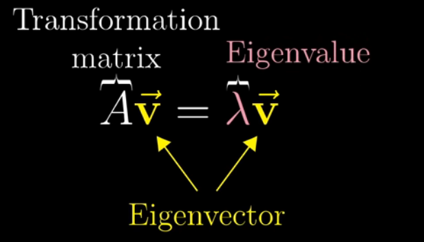
Now, let us understand how this PCA works.
The story begins with Eigenvalue and Eigenvector. In linear algebra, an eigenvector or characteristic vector of a linear transformation is a nonzero vector that changes at most by a scalar factor when that linear transformation is applied to it. The corresponding eigenvalue is the factor by which the eigenvector is scaled.
Apply PCA on whole MNISt data, start with the standardization of data.
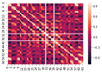
standardized_data = StandardScaler().fit_transform(x)

sample_data = standardized_data

# matrix multiplication using numpy
covar_matrix = np.matmul(sample_data.T , sample_data)

print ( "The shape of co-variance matrix = ", covar_matrix.shape)
The shape of co-variance matrix = (64, 64)
df=pd.DataFrame(covar_matrix)
sn.heatmap(df.corr())
values, vectors = eigh(covar_matrix, eigvals=(62,63))
print("Shape of eigen vectors = ",vectors.shape)
vectors = vectors.T
print("Updated shape of eigen vectors = ",vectors.shape)
Shape of eigen vectors = (64, 2) Updated shape of eigen vectors = (2, 64)
new_coordinates = np.matmul(vectors, sample_data.T)
print (" resultanat new data points' shape ", vectors.shape, "X", sample_data.T.shape," = ", new_coordinates.shape)
resultanat new data points’ shape (2, 64) X (64, 1797) = (2, 1797)
new_coordinates = np.vstack((new_coordinates, Y)).T
dataframe = pd.DataFrame(data=new_coordinates, columns=("1st_principal", "2nd_principal", "label"))
print(dataframe.head())
1st_principal 2nd_principal label 0 0.954502 1.914214 0.0 1 -0.924636 0.588980 1.0 2 0.317189 1.302039 2.0 3 0.868772 -3.020770 3.0 4 1.093480 4.528949 4.0
pca.n_components = 3
pca_data = pca.fit_transform(x)
print("shape of pca_reduced.shape = ", pca_data.shape)
pca_data = np.vstack((pca_data.T, Y)).T
pca_df = pd.DataFrame(data=pca_data, columns=("1st_principal", "2nd_principal", "3rd_principal","label"))<br>
sn.FacetGrid(pca_df, hue="label", size=6).map(plt.scatter, '1st_principal', '2nd_principal', '3rd_principal').add_legend()<br>
plt.show()
In order to look into a 3-D plot.
df = pd.DataFrame(pca_data,columns=['x','y','z','label'])
from mpl_toolkits.mplot3d import Axes3D
import matplotlib.pyplot as plt
import numpy as np
import pandas as pd

my_dpi=96
df['label']=pd.Categorical(df['label'])
my_color=df['label'].cat.codes
fig = plt.figure(figsize=(15,8))
ax = fig.add_subplot(111, projection='3d')

ax.scatter(df['x'], df['y'], df['z'],  c=my_color, cmap="Set2_r", s=5)

xAxisLine = ((min(df['x']), max(df['x'])), (0, 0), (0,0))
ax.plot(xAxisLine[0], xAxisLine[1], xAxisLine[2], 'r')
yAxisLine = ((0, 0), (min(df['y']), max(df['y'])), (0,0))
ax.plot(yAxisLine[0], yAxisLine[1], yAxisLine[2], 'g')
zAxisLine = ((0, 0), (0,0), (min(df['z']), max(df['z'])))
ax.plot(zAxisLine[0], zAxisLine[1], zAxisLine[2], 'b')

ax.set_xlabel("PC1")
ax.set_ylabel("PC2")
ax.set_zlabel("PC3")
ax.set_title("PCA on the iris data set")